Don’t get me wrong, my favorite color is and will always be (say it with me) blue! It’s not only my favorite but clearly top of mind with the folks at Pantone , as they recently announced their quintessential choice for 2020, “Classic Blue”, Instilling calm, confidence, and connection, this enduring blue hue highlights our desire for a dependable and stable foundation on which to build as we cross the threshold into a new era.
With that said, I am always looking to explore the broader world of color. Whether we’re designing for our clients at the beach, in the city, or out in the suburbs, color choice still ranks as one the most difficult decisions a homeowner makes.
From deep, moody grays to warm and sunny pinks, color not only informs our visual world, it effects our emotions and behaviors. As we head into the New Year, I thought it might be fun to share some of my favorite colors with you and show how we might use them.

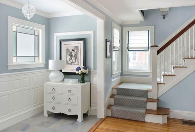
Beacon Gray (Benjamin Moore)
This is a perfect blend of pale blue and warm gray. Its soothing tone works like a neutral and allows other elements to shine. Bedrooms are definitely made for this shade!
Image: Homebunch.com

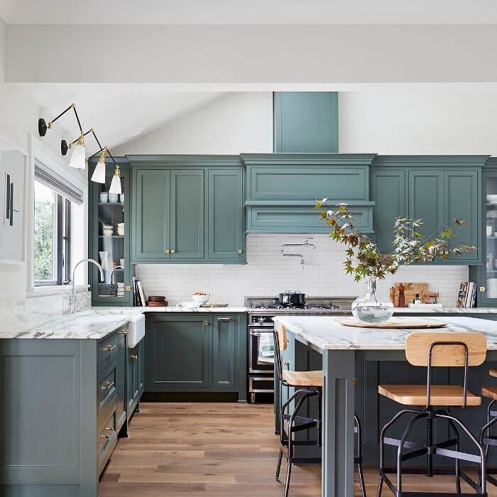
Underseas (Sherwin Williams)
I want this for my house! Love the saturated color with a vintage pre-war undertone. A little more green than blue, and that’s perfectly all right! Great for millwork and cabinetry.
Image: Emily Henderson
Peppercorn (Sherwin Williams)
Definitely watch out for this one! We like it for next year’s “Color of the Year”. Deep, dark, rich, and mysterious, this can be many colors at once, creating a bold statement without going black. Definitely paint a vanity or mudroom storage with this!
Image: Bernhardt Restoration

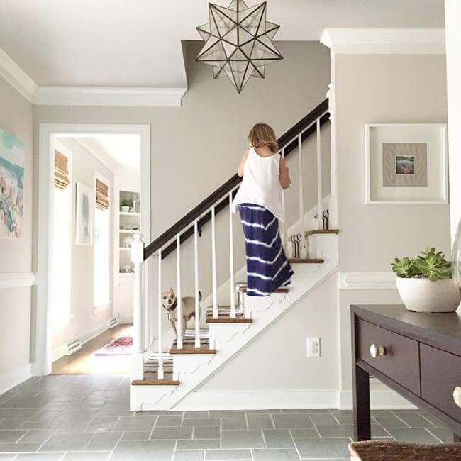
Edgecomb Gray (Benjamin Moore)
THE classic “greige”, this not too warm, not too cool neutral is a classic for a reason. Pair it with warm pinks or soft blues, you’ll never need to paint your walls again.
Image: Benjamin Moore

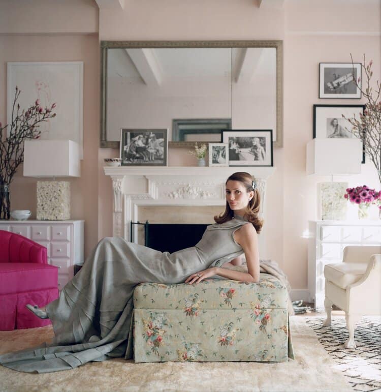
Pink Ground (Farrow & Ball)
This dusty pink, with a hint of warmth, creates the softest blush of color for a warm and soothing tone that doesn’t feel sugary or too sweet. This is definitely a grown up’s pink! Bedroom walls and dressing rooms are spot on to make sure you look great in the mirror!
Image: Vogue
